Repositioning a post-harvest technology company for banks and growers
VIST Labs, based in Illinois, makes patented post-harvest technology for cannabis growers. I redesigned its website so banks would see a regulated packaging technology company, and growers would still see the fix for failed microbial tests.
Role
Product Designer (solo), at Bleed & Margins
Timeline
3 months, remote, with stakeholders in Illinois, USA
Platform
Website
My work
Stakeholder research, positioning, information architecture, wireframes, visual design, build and handover
The brief was one line: look more pharmaceutical. One site then had to hold a lender who cannot be seen near cannabis and a grower who grows it.
The homepage hero I shipped. Cannabis is not named here.
The problem
VIST's banks needed to see a technology company.
Cannabis is legal in Illinois but still federally illegal, and 89% of community banks have no plans to serve the industry (RMA, 2024).
The old site opened with "Cannabis Remediation", sold through fear imagery like mould close-ups and "Would you inhale that?", and buried five patented processes in one long scroll.
CANNABIS, in capitals, in the first line a banker would read. The brief was really about that one word.
A banker had to read the site as a regulated technology company, and a grower had to still find their own industry on it.
Three audiences
Rad Source, Willow Industries and Ziel all market openly to cannabis, which VIST's banks couldn't accept.
I ran sessions with the founders, researched federal and FinCEN banking rules, audited the old site's content, and reviewed competitors. That left three audiences:
Audience
Needs to see
Lands on
Banks
A technology company that meets international standards
Home, About
Growers
Proof it works and passes state testing
Solutions
Finance teams
How to buy: own, lease, rent or subscribe
Opportunities
Key decisions
01
Two-tier messaging
The homepage speaks to the most conservative reader, with phrases like "plant-based industries" and "pharmaceutical-grade standards".
Cannabis appears one level down, on a Markets Served page.
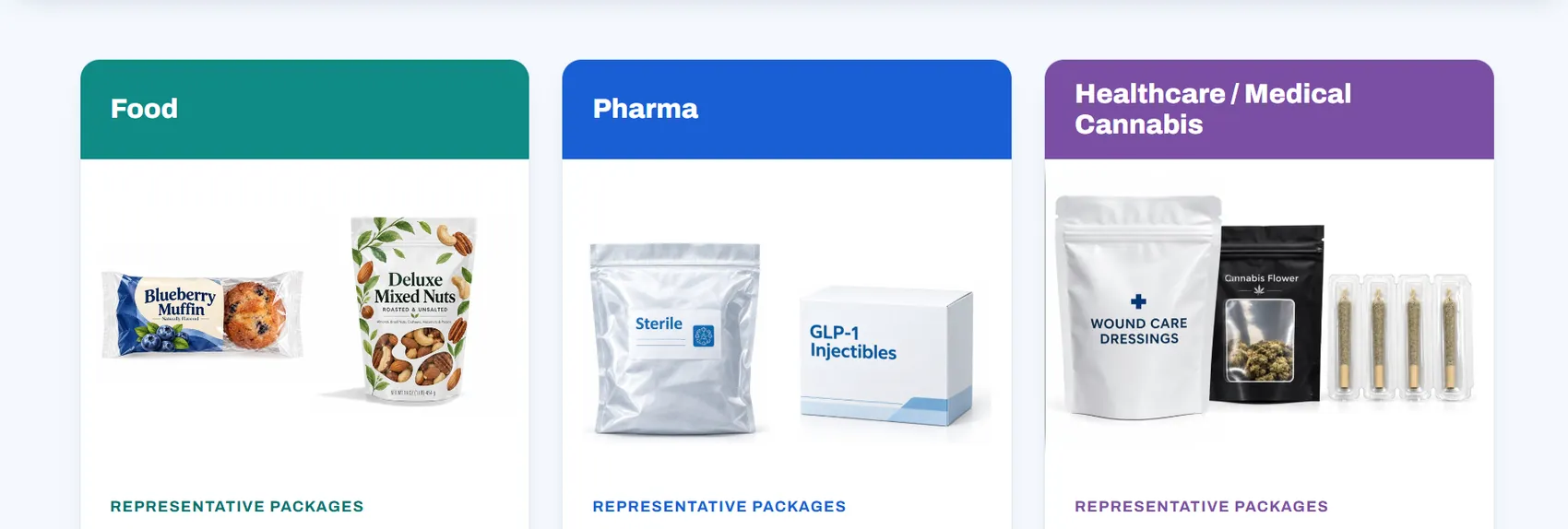
On that page cannabis sits third, behind Food and Pharma and in the same card as both. The ordering is the argument, which is framing done by position rather than by adjective. It makes cannabis one market VIST sells into instead of the business it is in, and a grower who lands there still finds their own industry written down.
A vocabulary map gave each service a bank-safe name and a grower-facing meaning: CryoPasteurization is "natural microbial load reduction" on the homepage and "decontamination for cannabis" for growers.
Trade-off: The homepage gives up search traffic for "cannabis decontamination", which the blog and solution pages pick up instead.
Food, Pharma, then Healthcare / Medical Cannabis. Same card, same weight, third in line.02
Structure built on problem, solution, then buying
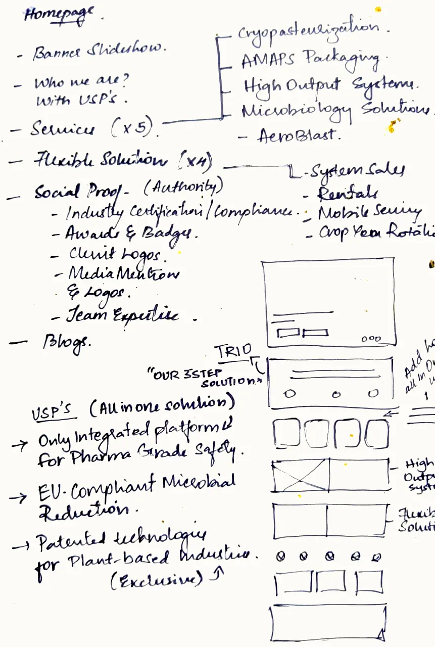
The homepage moves from the problem, to what VIST does, to how to buy.
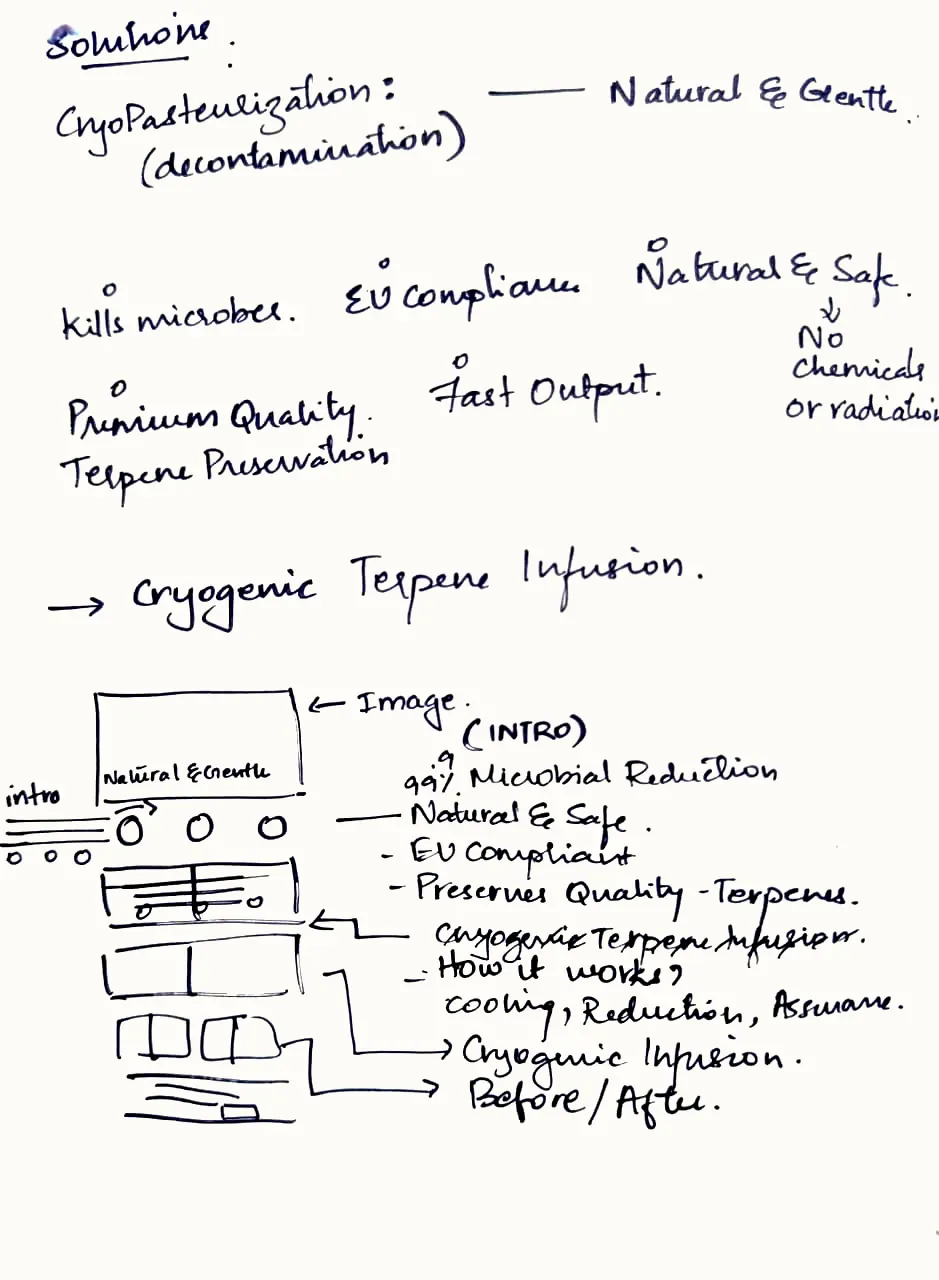
Each of the five services got its own product page from one template: proof points, how it works, before and after, and a consultation call to action.
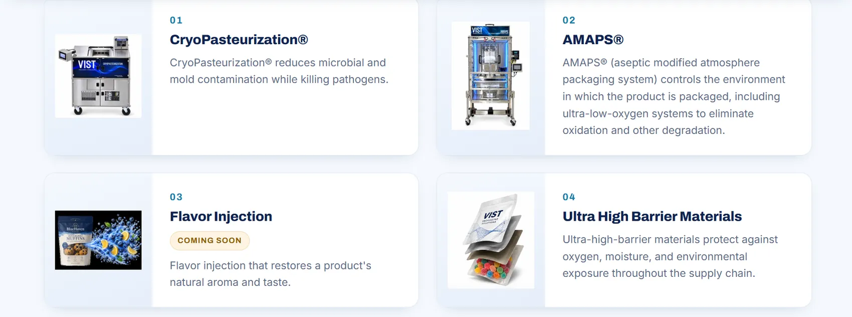
On the old site you met one process at a time down a long scroll. Bringing the whole set up onto the homepage as one block puts the size of the patent portfolio in a single screen. Flavor Injection keeps its "Coming soon" tag there, because an unreleased patent still reads as research capability to a bank.
The set as it sits on the homepage. Flavor Injection is the one that was not built, and says so.
The testing kits page was built to switch from enquiry to add-to-cart without a redesign, and buying options moved to their own Opportunities section.
Trade-off: One template gives less room to tailor each page to its technology.
1 / 3
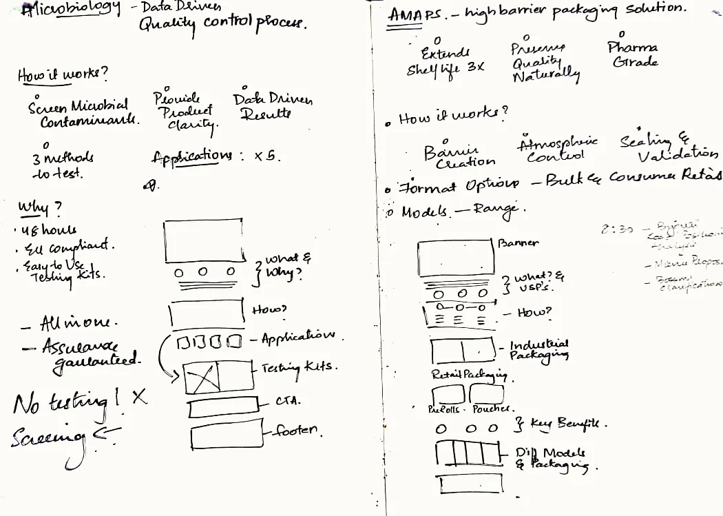
Two services and the homepage, worked out on paper before the template was set.03
Built one proof section for two readers
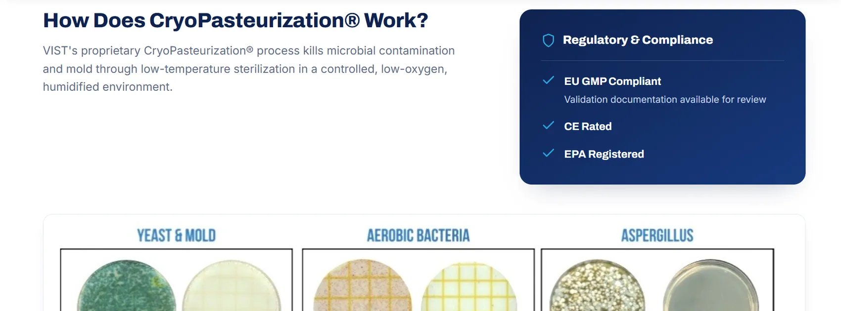
The petri dish rows are for the grower.
Yeast and mould, aerobic bacteria and aspergillus, each shown contaminated and then clean. A failed state test is what costs a grower a harvest, so this is the part they stop on.
A lender walks straight past the dishes to the Regulatory and Compliance panel beside them: EU GMP compliant with validation documentation available for review, CE rated, EPA registered. Neither reader needs the other's half, and neither has to open a second page to find their own.
The old site did this job with mould close-ups. Those came out, and claims a lender can check took their place: 99.9% microbial reduction, no chemicals or radiation, and terpenes preserved.
The dishes and the compliance panel, side by side. This is a scroll crop, and the dish rows carry on below the cut.
Outcome
The site launched on vistlabs.com as the client's primary site, the founders used it with their customers, and it is the site live there now.
I handed over the positioning framework, a sitemap of 6 sections and 12 sub-pages, wireframes, the design language and the live build itself. What the repositioning did for lead quality I can't show, because nothing was measured before it went up.
Homepage, certifications and How It Works, as handed over.
Reflection
Set a baseline before touching the site. Nothing about lead quality was measured on the old site, so the repositioning can be argued but not shown. A week of before numbers would have made the case for me.
The two-tier split costs search. Keeping cannabis off the homepage hands "cannabis decontamination" traffic to the deeper pages. For a company that still needs growers to find it, that trade is worth revisiting once the bank relationships are secure.